
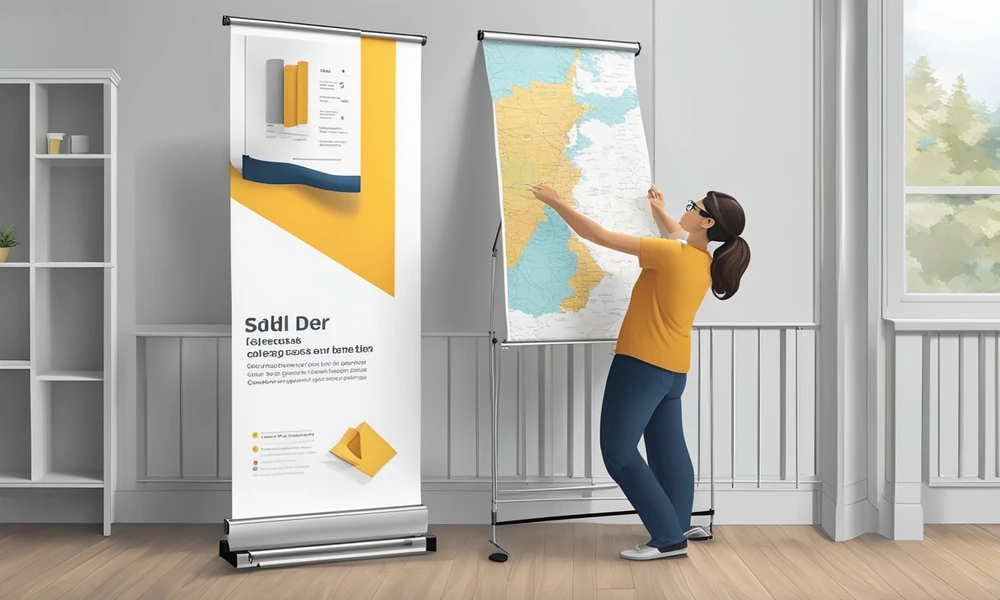
A crowded trade show floor is no place for a banner stand that tips over or a display that disappears in the glare. In that crucial moment when hundreds of eyes sweep the space, your retractable banner has to stand tall, stay put, and demand attention. Achieving this is not simply about choosing the right print, it’s about understanding the evolution of retractable banners and mastering the details of design and setup that set the pros apart.
The Origins of Retractable Banners: From Concept to Practical Use
Before event branding became a science, banners were cumbersome, heavy, and difficult to transport. Early versions were often vinyl sheets hung between poles, prone to wrinkles and wind. Marketers craved a solution that combined portability with professional presentation.
Early Designs and Materials
The first retractable banners relied on basic fabrics and manual tension, with stands that often wobbled or collapsed under pressure. It took several iterations to introduce spring-loaded mechanisms and stronger bases, moving away from materials that sagged or faded quickly.
The Rise of Portability in Marketing Tools
As businesses demanded quicker setups and lighter gear, retractable banners became more compact. The arrival of aluminum stands and roll-up mechanisms revolutionized exhibitions, allowing a single person to carry and assemble a large display in minutes.
Evolution of Banner Stability: Engineering Reliable Stands
A stable banner is non-negotiable, especially in bustling settings.
Twist-Out Feet and Base Improvements
Engineers solved early stability issues by developing stands with twist-out feet. This small innovation gives banners a broader base, preventing accidental topple and offering more surface contact, essential when the floor is crowded with moving feet and jostling bags.
Weight and Material Innovations for Wind Resistance
Outdoor and high-traffic indoor use called for further advances. Weighted bases and tougher materials now keep banners upright against gusts or drafts. Some stands even feature sand or water reservoirs, adding customizable stability based on venue conditions.
Enhancing Visibility: Material and Print Quality Advances
Stability gets your message seen; visibility ensures it’s remembered.
Transition to Matte Vinyl and Glare Reduction
One of the most significant leaps came with the switch to 13oz matte vinyl. Unlike glossy materials, matte vinyl diffuses harsh lighting, avoiding blinding glare that can obscure your message. This advancement means that, even under spotlights or in sunlit halls, the design stays crisp and inviting.
Optimizing Color Accuracy with CYMK Printing Standards
Another critical factor is color fidelity. Printing with the CMYK color model (cyan, magenta, yellow, black) ensures that hues remain vibrant and accurate from screen to print. This is vital when branding consistency matters across multiple marketing materials.
Design Considerations Through the Years
Details matter when your artwork transitions from computer screen to real-world banner.
Standard Sizing and Its Impact on Visibility
A standard retractable banner size, like 33″ x 81″, hits the sweet spot: tall enough to be noticed across the room and wide enough to communicate key details without overwhelming the viewer. This dimension maximizes presence while remaining manageable for transport and storage.
Safe Zones, Bleeds, and Print Resolution Best Practices
Professional printers urge designers to keep important text and graphics at least 1 inch inside the finished size, this “safe zone” ensures nothing critical is lost to trimming. A 0.5-inch bleed on all sides prevents white edges after cutting. For crisp visuals, files should be prepped at 150dpi, and colors set to CMYK.
Artwork Preparation: Ensuring a Flawless Final Product
Even the best stand and material can’t compensate for poor file setup.
Importance of PDF Formatting and Font Outlines
Printers prefer PDF submissions, as they lock in fonts and design elements. Converting text to outlines guarantees that nothing shifts or disappears if a font isn’t installed at the print shop.
Common Mistakes and How to Avoid Them
Designers often overlook the bottom three inches of the banner, forgetting it will be hidden by the stand. Crucial logos or calls to action should stay clear. Submitting files with incorrect color profiles or resolutions can also lead to disappointing results.
Modern Usage Scenarios and Setup Tips
Today’s retractable banners are built for environments where seconds matter.
Trade Shows and Busy Conventions: Maximizing Impact in Crowded Spaces
A well-placed, stable banner can draw traffic from across a crowded hall. To stand out, use high-contrast colors, minimal text, and images that can be grasped at a glance. Position banners near entrances or at corners for maximum footfall.
Quick Setup Techniques to Maintain Stability and Visibility
Extend twist-out feet fully and check for level ground before raising the banner. Secure the graphic’s top rail firmly; even minor slippage can make the banner lean or curl. A final check under the room’s lighting can reveal glare or shadow issues before the doors open.
Future Trends: What’s Next for Retractable Banner Technology?
Innovation in display graphics never stands still.
Emerging Materials and Sustainability Efforts
Eco-friendly materials, including recyclable vinyl and biodegradable plastics, are gaining traction, making banners greener without sacrificing quality. Lighter, stronger composites may further improve both portability and durability.
Integration of Digital Elements and Interactive Features
Some banners now include slots for tablets or QR codes, merging physical and digital engagement. In the coming years, we may see retractable banners with thin, embedded LED displays or smart sensors, delivering dynamic content while remaining easy to transport.
For anyone seeking professional results, partnering with a specialist such as banner printer Doculand ensures that every technical detail, from stability to print quality, is expertly managed. In the fast-paced world of promotional graphics, mastering these nuances is the difference between blending in and standing out.