
Do you know whether or not your customers enjoy browsing your website? Are they turned off before they ever have a chance to check out what your business has to offer?
A user-friendly website is a vital piece of a company’s image. It’s one of the first ways a potential customer will ever interact with your company, so it needs to be flawless.
To give your website an extra edge against your competition, we’ve collected some of the top business website design tips. Keep reading to learn more!
Stick With Simplicity
Making a website more useable starts by cutting out all the excess. Those extra graphics and flashing advertisements might seem like a good idea, but they’re more of an eyesore for your customers.
Don’t neglect your menu layout as well. No one wants to try and navigate through something too complicated. Instead, they want to find what they’re looking for and get on with their lives.
If you’re having trouble with keeping your customers on your website, try cutting back on the extras. Simplicity is often the best remedy when you want to make your customers happy.
If you’re uncertain whether or not your customers enjoy your website, make sure to check with analytics experts. A website such as decibel.com will show you where your website is lacking. It’s a great resource that all companies should use to help their numbers.
Clear Fonts
Fancy fonts look nice but they don’t make for a user-friendly website design. Anything that forces your customers to stop and try to interpret the words is a bad choice. Looping and cursive fonts are elegant but readability is far more important than style.
Your customers want to know what they’re reading without needing to double-check. If they’re unable to decipher what your website is saying, they’ll get frustrated and click away.
Pick fonts that are clear and legible to get the most out of your website.
Cohesive Color Scheme
Colors convey certain emotions, but you also need to make sure that those colors work well together. Think of the color scheme as a whole and pick colors that complement each other so that your website doesn’t end up looking garish.
Your website’s color choices shouldn’t hamper readability so try to stay away from anything too vibrant or neon.
When in doubt, go with a white background. It’s classy, easy to read, and matches with all accent colors. It gives your website a professional feeling without any extra effort.
Code Compression
Have you ever tried to enter a website, only to click away because it took forever to load? You don’t want this to be the story of your company’s website.
All of the different elements of your site need to load without any problems to ensure that your customers never get annoyed.
Code compression is one of the best ways to make a website more accessible to your users. It packs up the code in a way that lessens the load on the server whenever a customer clicks on it. It makes the traffic less demanding so that the website is both speedy and responsive.
If you’ve never implemented any type of code compression to your website, it’s time to start!
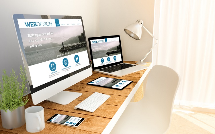
Mobile Optimization
Everyone uses a mobile device of some kind these days so your website needs to be optimized for their usage. If you don’t emphasize mobile optimization, you’ll be giving a bad experience to a large portion of your customer base.
Your layout should adapt to different screen sizes while still being responsive. All of the clickable elements need to be easy to press as your customers browse around using a single thumb or finger. Avoid putting these elements in the corners since they’re more difficult to reach on a mobile device.
Make sure to test your website for mobile optimization by trying it out yourself. A few tests on various devices is enough to show what needs to be changed for your customers to enjoy the browsing experience!
Use Standard Design Elements
Sometimes it pays to be unique, but most of the time it’s best to stick with tried-and-true methods of design. Standard design elements are the universal standard because they work. It’s better to use them as a base than to ignore them.
For example, having your company logo at the top of the screen is something we all expect to see. A search bar and a contact page are useful tools that customers rely on. Users might find it hard to navigate your website without these typical elements.
Try to use as many standard elements as possible to give your customers an easy experience as they look through your content.
Consistency Is Key
Every page of your website should have a similar look and layout. Your customers need to know what to expect when they click on a different blog post or product page.
If the style varies a lot from one page to another, the result looks unprofessional. What’s even worse is that it’s confusing for the customer because they expect one thing but receive another. No one wants to try and relearn the layout of a website page with every press of a button.
Go through every single page of your website and make sure that it looks cohesive. This makes it better for your customers and helps boost your company’s image at the same time.
A User-Friendly Website Is Every Company’s Best Friend
Every company needs a user-friendly website. Without it, all of your potential customers will click away to something else within only a few seconds of visiting. They need to feel like your website is both professional and inviting before they’ll spend time exploring all of your content.
Take the time to go through your website with a fine-tooth comb. Iron out any of the flaws until your website is perfect. Don’t forget to refer back to this list as an extra reminder from time to time!
For all the latest in business advice, make sure to check out the rest of our blog!